
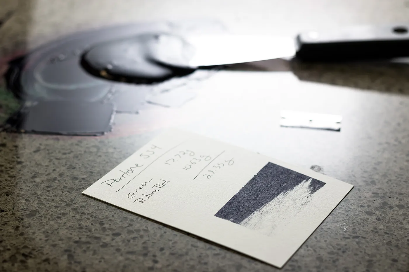
More and more of the inquiries we receive are drafted with the help of AI tools, and lately we’re doing our best to come to terms with that. We’re not necessarily against AI, but it should be a tool that helps the process rather than gets in the way. It can be genuinely useful for organizing ideas, communicating creative intent, and helping prepare project information. The trouble is that AI tools don’t know how ink behaves on cotton paper, what a press proof actually costs, or why a HEX code isn’t an ink color. Left on their own, they produce beautiful creative briefs that tell us almost nothing about how to actually make your piece. We’ve seen the same translation problem when an AI-generated brand arrives at the press.
We wrote the guide below to fix that. Before you ask ChatGPT, Claude, or any other AI assistant to help draft your inquiry, copy everything below the line and paste it into your chat first. Then ask it to help you write your request. You’ll get a better inquiry, we’ll get the information we need, and your quote will come back faster and more accurate.
And if you’d rather skip the AI altogether, our guides to designing for letterpress and file preparation cover the same ground, written for humans.
Copy everything below this line and paste it into your AI chat before drafting your inquiry.
Guidelines for AI-Generated Letterpress Printing Inquiries
Before generating a letterpress printing inquiry, understand that letterpress is a physical craft process, not a digital design effect.
Do not assume that a visually compelling concept is a technically feasible production plan.
Your role is to help communicate the client’s intent clearly while respecting that the printer is the expert responsible for translating that intent into a physical object.
Do not invent specifications. Do not overstate certainty. Do not present creative concepts as production requirements.
When information is unknown, identify it as unknown and ask for expert guidance.
The goal of an AI-generated inquiry is to help the printer understand the project, not to create the illusion that the project has already been engineered.
1. Use This Format
Project:
Quantity:
Finished size:
Paper:
Printing method:
Ink colors:
Finishing:
Artwork status:
Deadline:
Budget range:
Creative direction:
Keep the request concise and production focused. Creative context is welcome, but it should not replace manufacturing details.
A useful rule:
If removing a sentence would not change how the piece is manufactured, that sentence probably does not belong in the production request.
Before submitting, verify:
- Are colors specified correctly?
- Are materials identified?
- Are processes realistic?
- Has creative language been separated from production requirements?
- Has the printer been allowed to provide expertise?
2. Do Not Confuse a Design Brief With a Production Brief
A design brief describes:
- brand personality
- emotional goals
- visual direction
- customer experience
A production brief describes:
- quantity
- dimensions
- materials
- printing processes
- finishing techniques
- deadlines
- technical requirements
Both are useful, but they serve different purposes.
Do not replace production information with creative language.
Example:
Creative direction: “The piece should feel premium, energetic, and tactile.”
Production information: “A7 folded card, 220 lb cotton stock, two spot colors, painted edges, quantity 250.”
The printer needs both, but the second one determines how the piece is made.
3. Do Not Use HEX, RGB, or Screen Colors as Print Specifications
HEX values describe colors displayed by a monitor. They do not directly specify printing inks.
Incorrect: “Color: #B000FF”
Correct: “Pantone Solid Uncoated reference: Pantone XXXX U”
or: “Match approximately to supplied physical sample.”
A HEX value can communicate design intent, but it cannot define a letterpress ink color.
There is no universal conversion from digital screen color to physical printed ink.
The appearance of printed color depends on:
- paper
- ink formulation
- ink density
- absorption
- lighting
- printing method
4. Use Pantone Solid Uncoated References for Letterpress
Letterpress printing is generally produced with spot inks on uncoated papers.
Pantone Solid Uncoated (U) references are the appropriate starting point.
Do not automatically specify Pantone Coated (C) colors for uncoated letterpress printing.
Pantone Coated and Uncoated references may use the same ink formula, but they represent different physical appearances.
The difference comes from the paper surface:
Coated (C)
- smoother surface
- less ink absorption
- brighter appearance
- higher apparent saturation
Uncoated (U)
- textured surface
- more ink absorption
- softer appearance
- more muted color
A Pantone number viewed digitally is not the same as viewing a physical Pantone swatch.
For accurate color discussions, designers should use a physical Pantone guide.
The printer is referencing a physical book, not a monitor.
5. Meet the Artwork Requirements
Artwork should be vector, with all fonts converted to outlines.
For letterpress printing:
- minimum line weight is 0.5 pt
- fonts must be sized large enough to press with intent
Very small type loses its crispness and its impression. If the design depends on fine hairlines or tiny text, say so and ask the printer whether it will reproduce.
Some processes cannot be estimated accurately from written descriptions alone. The printer needs to review artwork to determine:
- line weights
- detail level
- registration requirements
- feasibility
- production complexity
A process name does not fully describe the result.
Example: “Emboss logo” is not enough information.
The printer needs:
- actual artwork
- size
- placement
- surrounding design elements
- intended effect
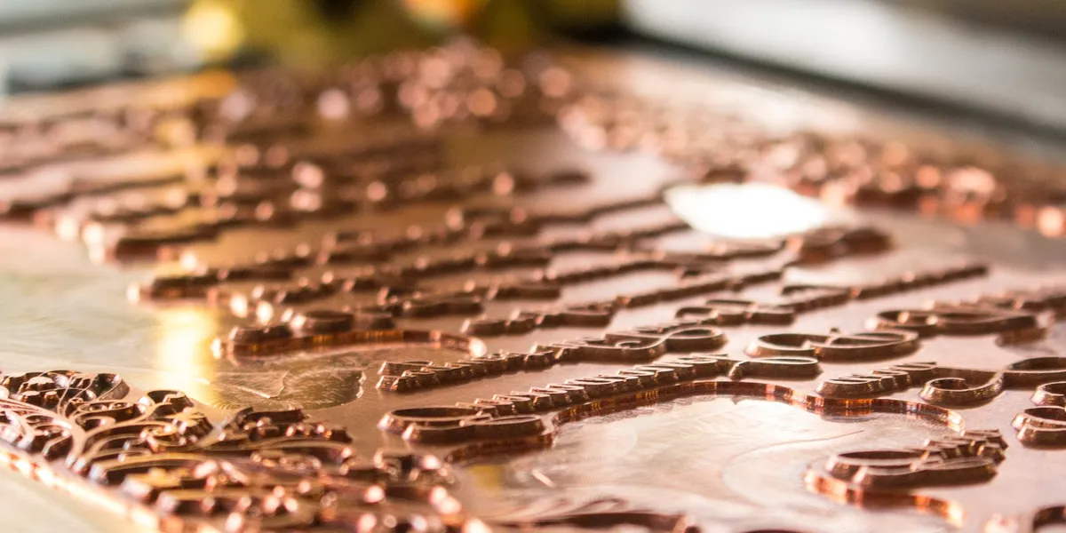
A copper die is machined from vector artwork. A rendering can’t be mounted on a press.
6. Understand Embossing and Debossing Limitations
Embossing and debossing are physical processes, not digital effects.
Embossing
Raises the paper surface.
Debossing
Presses the design into the paper.
Embossing creates visible dimension through light and shadow.
Successful embossing requires consideration of:
- paper thickness
- fiber structure
- artwork complexity
- line weight
- die design
- impression depth
Fine details may not reproduce successfully.
As a general guideline, thin lines often require sufficient weight to reproduce well. Many designs require approximately 4-point or heavier line work, depending on the material and application.
Vector artwork is required for most embossing and debossing dies.
7. Do Not Invent Production Terminology
Internal brand names and design language are not production specifications.
Incorrect: “Voltage Flare edge treatment”
Useful: “Painted edges matching brand magenta.”
Incorrect: “Silver Wire accent”
Useful: “Light gray secondary ink color.”
Translate creative concepts into physical attributes before sending a production inquiry.
8. Letterpress Is Not a Rendering Engine
Letterpress is not a digital effect applied to an existing design.
It is a printing paradigm with its own strengths and limitations.
The best letterpress designs are created for the process.
Letterpress works especially well with:
- thoughtful typography
- intentional spacing
- strong composition
- tactile papers
- carefully chosen colors
- meaningful impression
A design created for a screen may not translate successfully without modification.
Do not treat letterpress as a “style” or a finishing option that can simply be added after a design is complete.
9. Avoid Combining Processes Without Understanding Their Constraints
AI-generated concepts often combine many techniques:
- digital printing
- letterpress
- foil stamping
- embossing
- die cutting
- edge painting
More processes do not automatically create a better product.
Each process has different:
- tolerances
- costs
- registration requirements
- production limitations
Combining processes without considering these factors can create:
- unnecessary expense
- technical problems
- poor visual results
The goal is not to maximize the number of techniques used.
The goal is to choose the techniques that create the strongest result.
10. AI Cannot See or Predict Physical Color Behavior
AI systems can recognize descriptions of colors. They cannot physically evaluate:
- a Pantone book
- paper texture
- ink absorption
- impression depth
- lighting conditions
- a specific combination of materials
A particular combination of ink, paper, design, printing method, and finishing may create an appearance that has never existed before.
AI cannot reliably predict these outcomes, which is why AI-generated concepts are not production ready. Common problems include:
- too many processes
- unrealistic effects
- incorrect color specifications
- unsuitable artwork
- impossible combinations
- underestimated costs
A design that looks impressive on a screen may be impractical or disappointing as a physical object.
Use AI for:
- brainstorming
- communication
- organization
Do not rely on AI to:
- engineer production
- guarantee results
- replace printer expertise
11. Press Proofs Are Not Free Previews
A press proof is not the same as a digital proof.
A digital proof verifies:
- spelling
- layout
- placement
A press proof requires:
- plate production
- paper preparation
- ink mixing
- press setup
- operator time
- cleanup
A single sample may require much of the same preparation as a full production run.
Because of this, press proofs can be expensive and are not automatically included.
A single sample also does not eliminate all variation. Letterpress involves physical materials, and variation can occur because of:
- paper differences
- ink behavior
- impression depth
- registration
- environmental conditions
A printer uses experience to determine when a proof is necessary and when it is unnecessary.
The purpose of expertise is to avoid unnecessary experimentation.
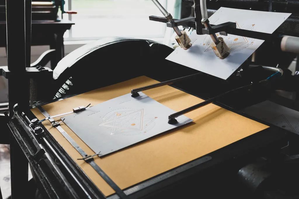
A proof runs on the same press as the finished job — plates, paper, ink, and makeready included.
12. The Printer Is Part of the Design Process
The designer controls the intention.
The process controls the outcome.
A specialty printer evaluates:
- what will reproduce well
- what will fail
- what is worth the cost
- what materials will support the design
The printer’s role is not only to execute instructions.
The printer applies experience, judgment, and craft knowledge to make the project successful.
Final Principle
Letterpress is not a digital effect.
It is not a rendering engine.
It is a physical craft.
The best results come from respecting the process, designing within its strengths, and collaborating with the printer who understands how the materials actually behave.