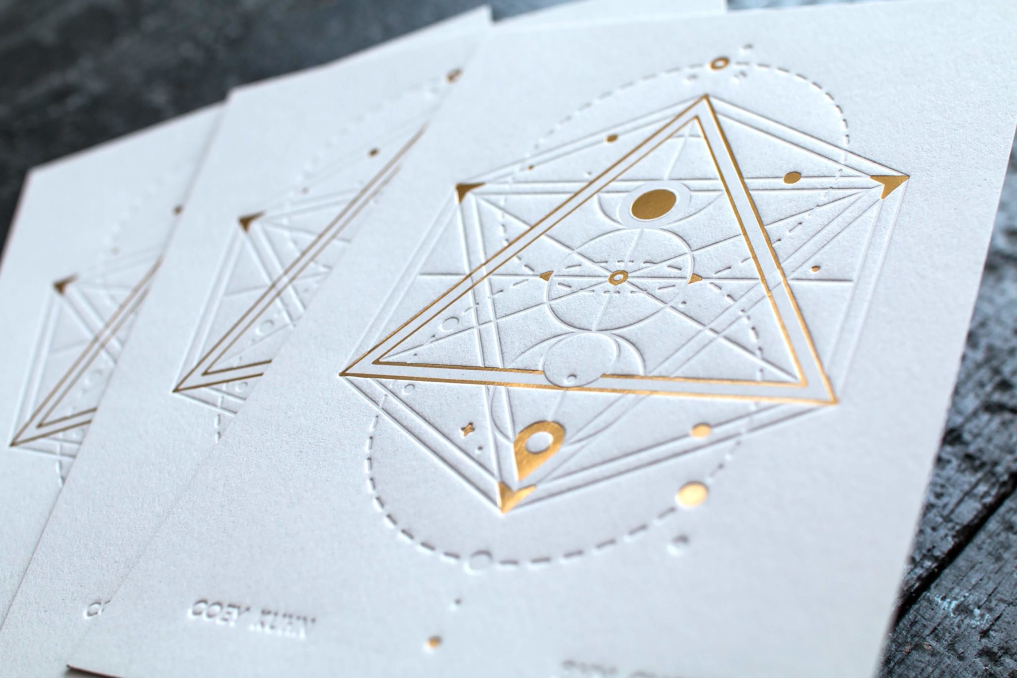
How to get the best results with your letterpress design
When you want the deepest impression, it is a good idea to go a little bigger and bolder with your type design. Every typeface is different, but a great rule of thumb is to make sure there are no lines that are thinner than .25 points thick. It's a good idea to add a light stroke to punctuation and fine lines to make them a bit heavier on the plate. Consider that your design will be pressed with up to 40 tons of pressure. We will be glad to review your artwork for print friendliness.
Letterpress designs need to account for the limitations of the process. The name itself is a guide - it is designed for pressing letters. In that sense, it works best with typography and line-art with a lot of white space. It is really not ideal for larger areas of ink. Letterpress was once the only type of printing, and there's a good reason it is now a niche process. But when a design is created to work within the strengths of the letterpress process, it is truly a thing of beauty.
In printing lingo, a Reverse is an image that is created by printing the paper around the artwork, displaying the artwork as the paper color. An example of this would be a business card design that relies on printing the entire face of the card in a color, with a white logo in the center.
You should avoid this for two reasons:
1. On uncoated paper, a large area of ink coverage is subject to abraisve transfer. For example, if you enclose your business card with a letter in the mail, you may find that the ink has transferred onto the letter. This is true of any prints on uncoated paper, by the way! We have seen this from modern digital printing as well.
2. The inking systems of letterpress machines were not designed to print this level of coverage. The inking will be prone to graininess and ghosting, where a shadow of the image is visible in the shadow due to the rolling motion of the press rollers.
However, there are exceptions to every rule! We can absolutely push the process for smaller orders. It becomes trickier trying to get consistency for larger runs, like for business cards for a bigger company.
Colored paper is the best choice for a background colors, instead of printing that color with ink. Letterpress is not ideal for printing big solid areas of color in a clean consistent way.
Our advice is to consider the paper as part of the design process, because the color and texture can form a major component of the look of your prints. See our Paper Selection Guide for a few options.
While there are many beautiful paper colors on the market, the available colors are more limited than the Pantone system. So it is a good idea to specify a paper stock and color when creating your design's color palette. This way, there are no compromises that must be made when going to print.
If your design calls for a color on the front and white on the back, that works, too! We can mount papers together to create a custom two-tone card.
All letterpress inks are transparent.
It's best to create your design as vector art from a design program such as Adobe Illustrator or Indesign. Vector art scales infinitely to any resolution, so it's easy for us to generate letterpress plates at the highest resolution possible with our equipment, which is 3000 pixels per inch. This lets us create super crisp plates that print beautifully.
It is technically possible to print a design created in Photoshop with letterpress, but you have to consider the requirements of the process. The rule of thumb of 300ppi is not enough resolution when it comes to letterpress typography or line-art. The minimum resolution should be 1200ppi in bitmap color mode. This is great for hand-drawn illustrations or lettering. But for typographical layout using fonts, we would encourage you to use a different application.
Your project will be cut to size after printing, so it's important to allow the design to have some bleed (or a continuation of design beyond the trim size) to account for this.
It's important to note that when designs that have large areas of solids or coverage, the impression depth into the paper will not be as noticeable or deep as it would be with line art or typography. Lines that are at least .25 points thick will allow for the deepest impression.


