When it comes to day-of stationery, the menu card is too often an afterthought. We think that should change, because it’s one of the best places to display your creativity. The talented Alyssa Amez Design seized this opportunity in a big way with these luxurious, personalized menu cards.
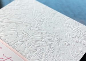
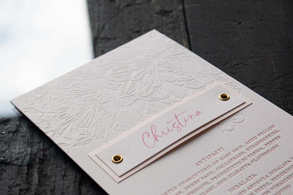
Instead of a traditional place card, Alyssa’s concept was to embellish each menu with the guest’s name, giving each place setting a uniquely thoughtful touch. A live flower was gently tucked behind every name card, imparting each menu a fresh and fragrant presentation. Beneath the flower, a coordinated floral motif was pressed with a deep blind deboss, creating an evocative texture. Blind debossing is the process by which we press a letterpress impression without using ink.
The menu details were printed with two versions, including a vegan option. All menu details were printed using letterpress printing using a custom Pantone-matched ink. Each guest name was digitally printed in a corresponding ink color. Can you imagine seeing these personalized menus placed at each table setting during the wedding reception?
This stunning menu is a great example of mixing printing methods to achieve a design goal to create a truly unique work of art.
Paper selections: Neenah Cotton 220lb in Pearl White, Gmund Colors Matte 111lb in Powder Pink